It's a best practice for usage-based companies to offer in-app consumption dashboards to empower customers to monitor their usage and exercise control over their spending. During our time building OpenMeter, we've encountered various usage dashboards from our vendors and have assisted numerous customers in crafting their own. But what truly defines a great usage dashboard? This article delves into the essential components and explores what leading companies are doing in this domain.
Why provide a usage dashboard?
One of the fundamental principles of usage-based pricing is that customers only pay for what they consume, and this way, they can control their spending. A tight feedback loop is essential. If you consume more than expected, you want to know it early so you can act on it before it leads to overspending. This is important not just for the customers but for the vendor, too. Unexpected costs can ultimately lead to customer churn.
Key Elements of a Great Usage Dashboard
Let's discuss what makes a great usage dashboard, starting from the most critical aspects and gradually progressing to desirable additions:
- Make the usage feedback instant
- Visualize consumption
- Offer data granularity
- Allow customer to set their thresholds
- Enable historical data
- Highlight tier limits
- Offer tips to reduce usage
- Forecast future usage
- Identity trends
Instant Usage Feedback
Effective usage feedback must be swift, allowing customers to respond quickly. Ideally, users' interaction with your product should be reflected on their usage dashboard within seconds. Achieving this requires a metering data source capable of instantaneously reflecting usage changes. This is particularly crucial for API products, where software glitches or DDoS attacks can result in significant usage spikes and billing anomalies within a short timeframe.
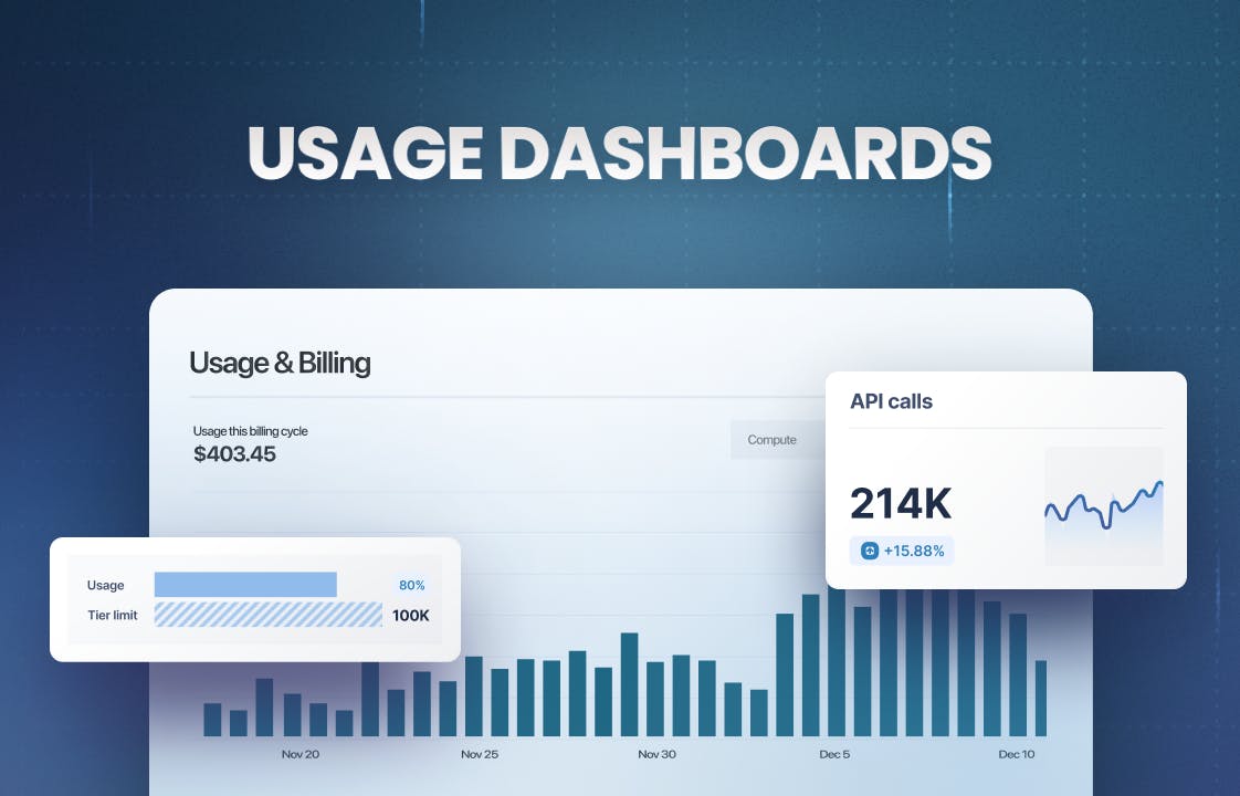
Visualizing Consumption
For humans, it’s easier to interpret data as charts than raw tables. Many usage-based products provide extensive tables of consumption data, making it challenging to compare periods, identify anomalies, and discern trends from text alone. Great products not only furnish charts and tables but also offer the option to download the data for analysis with external tools.
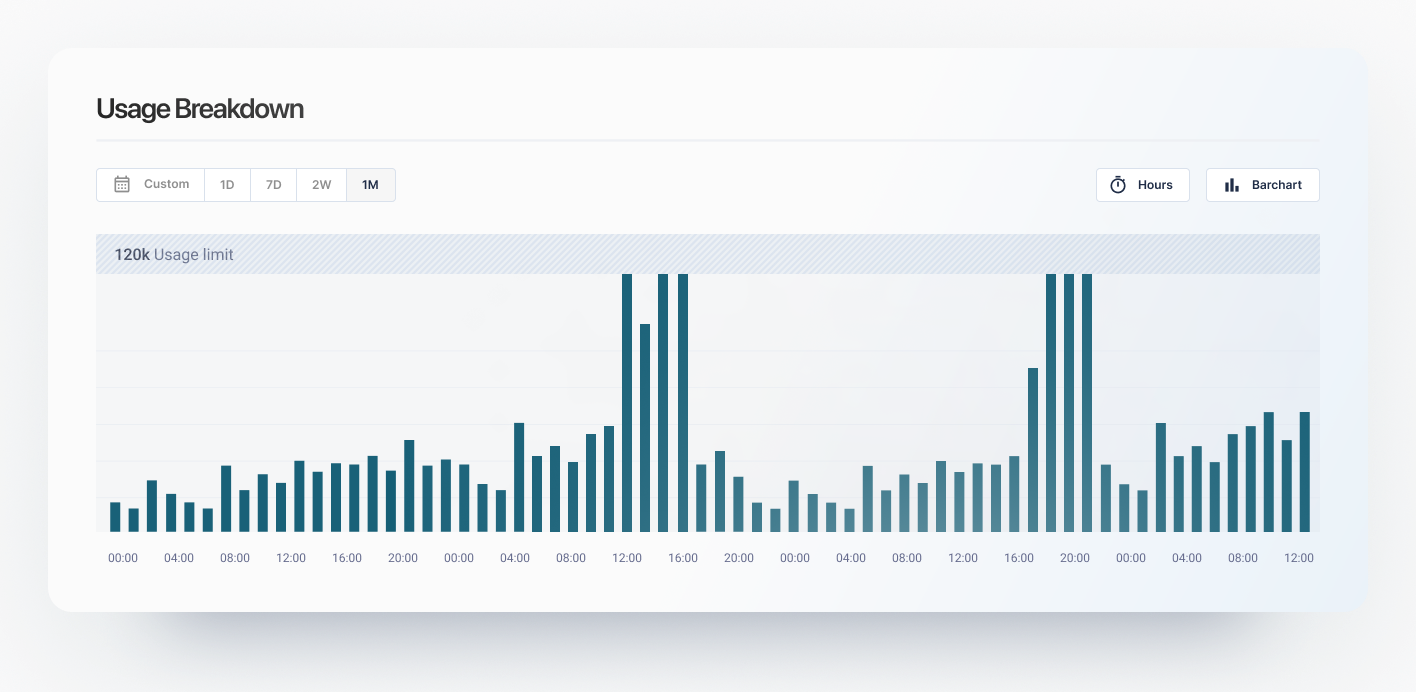
Data Granularity
As usage spikes can happen throughout the day, the customer needs to be able to look at consumption in smaller windows, at least hourly, to identify problematic periods and correlate them with their system metrics. Instead of only displaying monthly totals, empower your users to explore data using various time windows.
Usage Thresholds
It's a great idea to allow your customers to set their thresholds to be notified when they reach their limit. For instance, many companies adopt setting budgets and thresholds on their AWS accounts as a primary step. Other than notifications, we have even seen exceptionally customer-friendly vendors stop billing at the threshold and wave overages in a reasonable range.
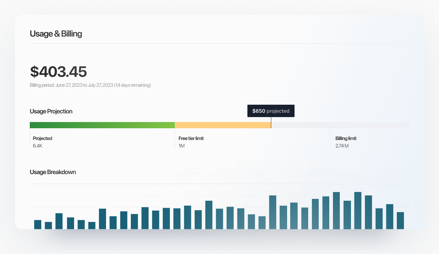
Historical Data Access
While showcasing current and previous billing period consumption is crucial, it's equally important to grant access to historical usage data. Allowing customers to review historical data enables them to identify trends and forecast long-term spending. This facilitates proactive consumption optimization, preventing churn when costs escalate. It can also stimulate discussions around annual contracts and foster stronger partnerships.
Tier Limit Highlights
Many freemium or tier-based products have usage limits. It's beneficial to prominently display these limits on the consumption indicator so the customer knows when they will be charged or need to upgrade. The most user-friendly products also send notifications as users approach these limits, typically at 80%, 95%, and 100%.
Usage Optimization Tips
It's one of the simplest to implement for your users but also the most effective. Link relevant documentation to your usage dashboard, providing insights on how customers can optimize their consumption effectively.
Usage Forecasting
Predicting usage for the entire billing period proves valuable for customers, offering insights into estimated costs. Most individuals likely perform mental calculations when reviewing consumption metrics, so automating this process is a thoughtful touch. Leveraging historical data, vendors can make reasonably accurate usage projections.
Identifying Trends
While proficient users can identify trends through visualization, it's even more advantageous if the dashboard can highlight trends autonomously. Identifying month-over-month usage growth, especially if it aligns with a customer's business expansion, is particularly useful, as optimal usage-based pricing correlates with customer value.
Building Your In-App Usage Dashboard
Constructing an effective usage dashboard can be time-consuming. It necessitates real-time processing of usage data to provide instant feedback and support various time ranges and windows. Visualization of usage, implementation of thresholds, and notifications are also critical aspects. This is where OpenMeter steps in, offering a consumer portal to streamline the creation of exceptional usage dashboards within your application. While OpenMeter can aggregate millions of events instantly, the consumer portal gives customer-level access to this usage data, which you can integrate easily with our React hooks. Our consumer portal is available in the Open Source distribution and OpenMeter Cloud.